top of page
Marine Network | Brand Identity Design
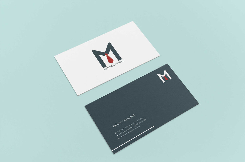
Designed for a Singapore-based maritime news magazine, this brand identity strikes a balance between bold industry presence and corporate sophistication. The logo concept combines the strong silhouette of a ship’s bow with the clean formality of a red tie—subtly weaving together the worlds of marine engineering and executive insight.
The visual language extends seamlessly across print collateral, from business cards to publication covers, using a clean, structured grid and a refined palette to reinforce trust and professionalism. A brand made to navigate boardrooms and break waves—confident, sharp, and purpose-driven.
Service
Brand Identity, Print, Visual Storytelling
Client
Marine Network

ALL PROJECTS
bottom of page


